Coffee Subscription Service
Project Brief: Coffee Subscription Website
Project Overview
The coffee subscription website is designed to enhance the coffee discovery experience by addressing key user pain points identified through UX research.
The platform offers a seamless and transparent subscription model that allows users to explore various coffee options before committing to a specific blend.
Through comprehensive user interviews and competitive analysis, the project focuses on delivering an intuitive and user-friendly experience that prioritizes pricing transparency and personalized coffee selection.
Objective: To create a coffee subscription service that improves user satisfaction by offering a clear pricing structure and a curated sampling experience, enabling users to discover their preferred coffee blend effortlessly.
Research & Insights:
Conducted several user interviews to identify common frustrations and needs.
Performed competitive analysis of similar subscription services to assess industry standards and areas for differentiation.
Discovered two primary pain points:
Lack of transparency in pricing across existing services.
Difficulty in discovering the perfect coffee blend without prior sampling.
Key Features:
Transparent Pricing:
Clearly defined subscription tiers with no hidden costs.
A detailed breakdown of pricing, shipping, and add-ons.
Coffee Discovery through Sampling:
Users can receive a curated selection of coffee samples before choosing a full-size subscription.
Personalized recommendations based on user preferences and feedback.
Seamless User Experience:
Intuitive interface with a smooth onboarding process.
Subscription customization options tailored to user preferences.
Data-Driven Personalization:
A preference-based system that refines recommendations based on previous selections.
User ratings and reviews incorporated for improved personalization.
Design Approach:
User-Centered Design (UCD) methodology, ensuring that the website structure and features are directly informed by user needs and behaviors.
Iterative prototyping and usability testing to validate design decisions and enhance the overall experience.
Accessible and visually appealing interface aligning with modern UX best practices.
Expected Outcomes:
Increased user engagement and retention due to a transparent and user-friendly subscription process.
Higher conversion rates by reducing the hesitation associated with choosing a coffee subscription.
Strengthened brand trust and loyalty through clear communication and personalization features.
Conclusion
By addressing the identified pain points of pricing transparency and coffee discovery, this coffee subscription website aims to redefine the user experience in the specialty coffee market. The emphasis on UX research ensures a thoughtful, data-driven approach that meets user expectations while differentiating the service from competitors.
Empathy mapping and Tag Design
Coffee Subscription Website: A Design Journey
Research & Insights
I started with thorough user research, and gathered Data from different resources: Comments on different coffee subscription websites like Trade, Driftaway, Digikala, Beanz , and etc, Different websites FAQs, Related comments on Youtube, and etc.
Besides, I have conducted multiple user interview and created an empathy map out of that interviews.
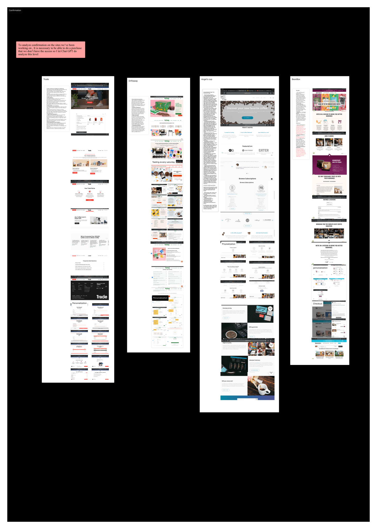
After identifying insights into what a coffee subscription service should offer and understanding user pain points, I conducted a competitor analysis of three leading subscription services and one weaker competitor. The goal was to identify areas where mistakes are commonly made and uncover opportunities for improvement.

Examining users' concerns has brought me to categorize the data gathered and I came up with a number of tags
that paws a way to what users actually need.
Tags:
#Subscription
#Features
#Learn
#Preferences
#Purchese
#Pain
#Needs
#Shipping
…
Competitor Analysis
The framework introduced in our boot camp was Mayor’s 7 Levels of Conversion.
Relevance
Trust
Orientation
Stimulance
Convenience
Security
Confirmation

Competitor analysis of 5 similar products
Relevance
Trust

Orientation

Convinience
Stimulation
Confirmation
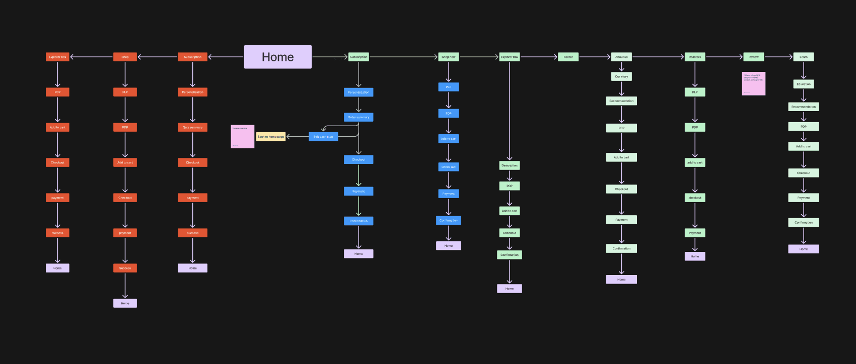
site map
Based on the data at hand, I started to design a site map for the users. And as the project was going on I revised this map.
Design Kit
Primary Color
Then It was turn to decide the brand color which I decided to pick red for this purpose to induce feeling of Energy and Excitement that coffee is associated with.
Font
The Roboto font was chosen for its modern, clean design that ensures excellent readability and accessibility across devices.
Assets
The assets, including the grid system, buttons, color palette, typography, input fields, and icons, were designed to create a cohesive and visually appealing user interface. The grid system ensures consistency in layout, while the buttons, typography, and input fields enhance usability and accessibility. The color palette and icons were chosen to reflect the app’s energy, maintain clarity, and provide intuitive navigation.

With these insights in hand, I proceeded to design the website.

Onboarding the users
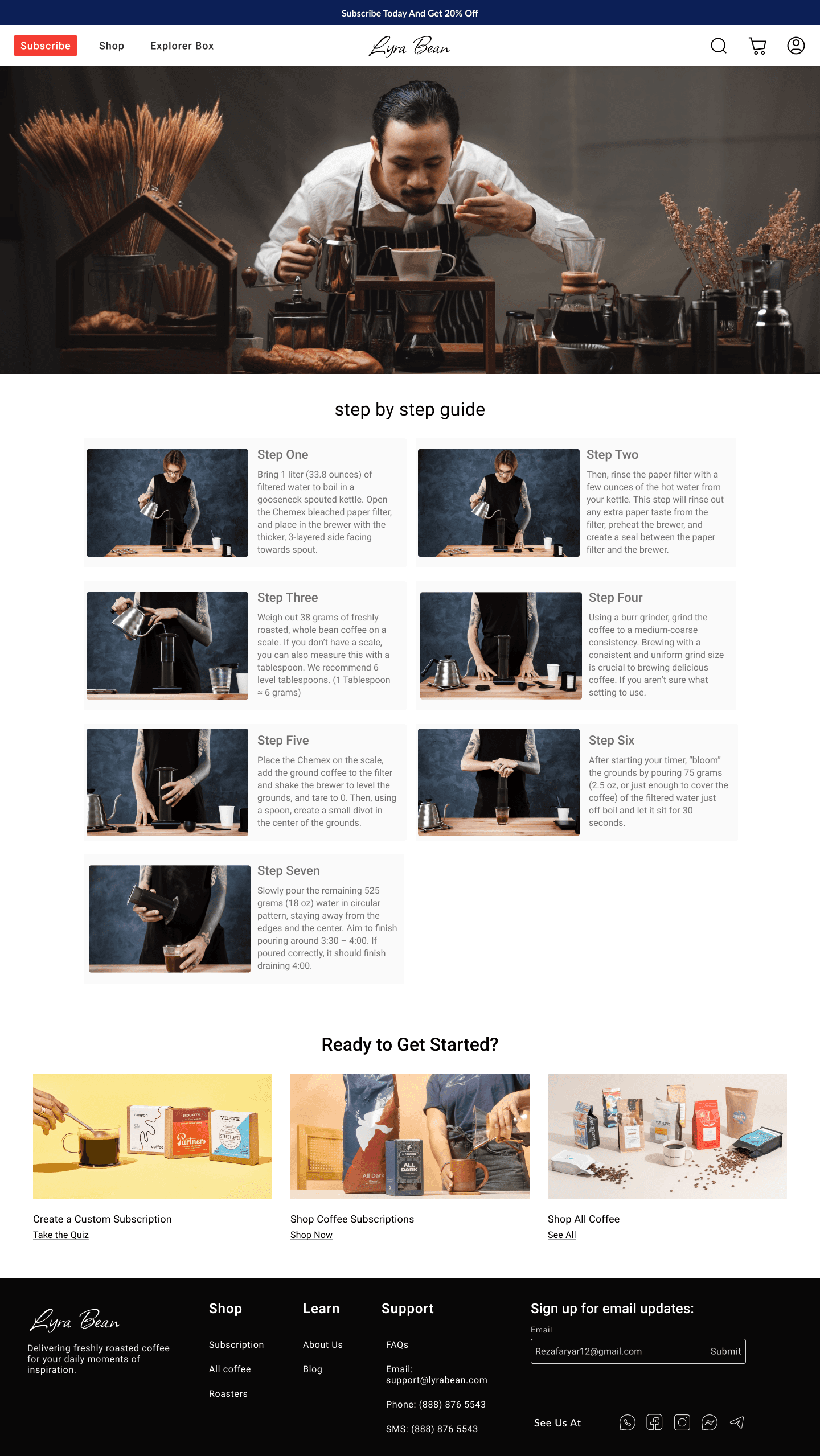
Shop sections for those who wants to try a coffee
The need for sampling different coffee
business values
Roasters they work with

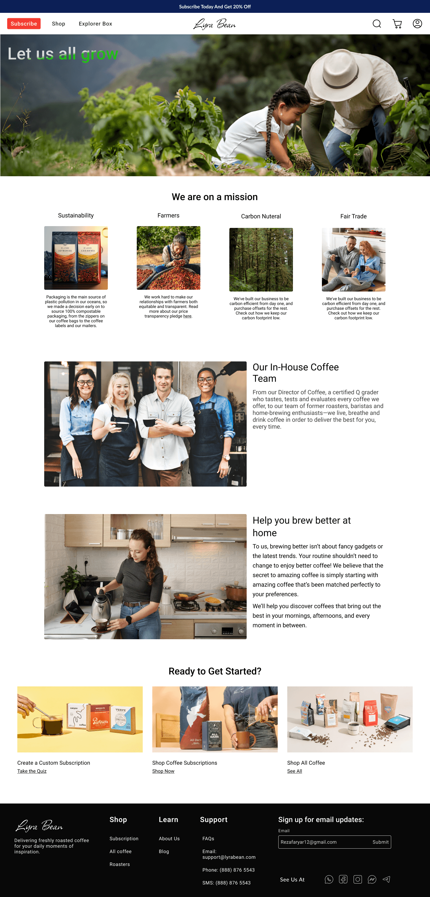


3 different home page for 3 kind of users (Loyal, Logined, guest user)
And I have designed 3 different user flows for new logined users, users who have used the website for a while, and user who are guest to higher conversion rate through providing users a friendly environment.
Back to Home
Wanna have a talk? Let’s connect
Rezafaryar12@gmail.com
+989338338531